Edited on February 23, 2015 to include pictures of the matching bookmark.
Ambition is the 25th edition in the Field Notes Colors series, and I love almost everything about it. My initial reactions are like this in a nutshell:
- Three different types of books: That’s interesting!
- French Paper covers: I missed you.
- Off-white pages: Oooh~♡
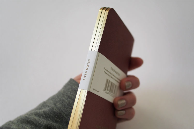
- Gold-colored staples: Yes!
- Gilded edges: GET OUT!

Gold-colored staples

French Paper Speckletone samples + Ambition + Balsam Fir (far right with white text on cover)
What I didn’t realize until I received my own 3-packs of Ambition is that the green ledger book uses the same cover stock as the Balsam Fir edition does, which is the French Paper Speckletone in “Olive”. Even though Balsam Fir is one of my top favorite Field Notes, I almost didn’t recognize the olive paper in Ambition because with gold accents, it managed to get a completely different personality. I particularly enjoyed this little surprise.
Embossed logotype
Embossing seen from the inside front covers
Firsts
Let me get the “thirds” out of the way first. Ambition is the 3rd in the Colors series to get its covers embossed, after Northerly and Traveling Salesman. It is also the 3rd to feature gold-colored staples, after Drink Local and Shelterwood.
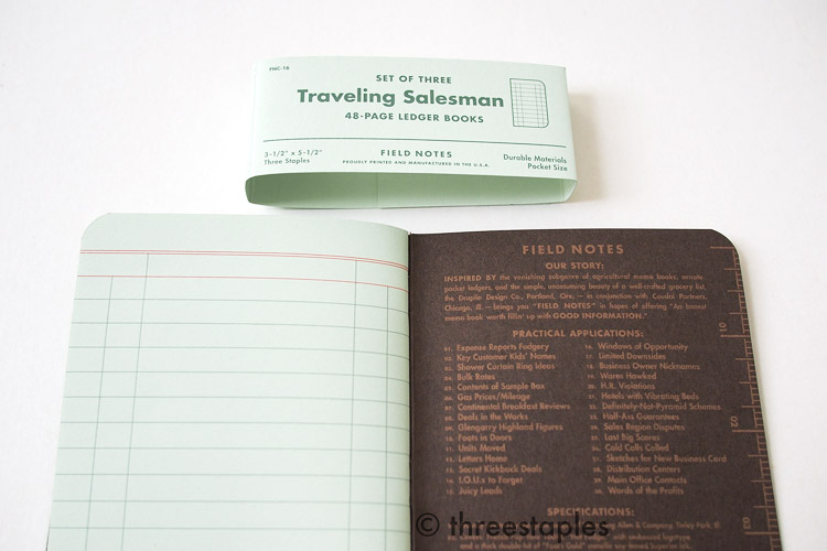
As for “firsts”, they are pretty significant. By now it’s not very surprising to see 3 different colors in a pack of Field Notes. But 3 different types of ruling inside? That was definitely not expected.
A ledger. A weekly planner. A memo book.
(I don’t know, for some strange reason, when I watched the Ambition video, I thought of that time Steve Jobs announced the iPhone:
An iPod. A phone. An internet communicator.
An iPod. A phone. Are you getting it?
… okay, back to Field Notes.)
The “Chocolate” weekly planner (which, by the way, is not as rich brown as the Traveling Salesman) is the most interesting book out of the three, in terms of “firsts” in the Colors series. Simply, a datebook has never been done before! And to accommodate all weeks of the year, the brown book includes 56 pages, instead of the usual 48 pages.
Field Notes ledger books: Ambition (left) and Traveling Salesman (right)
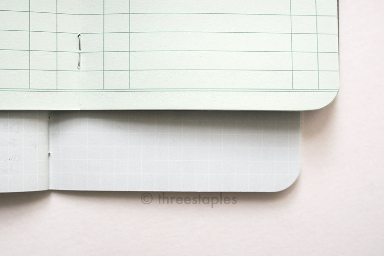
We’ve seen the ledger lines before in Traveling Salesman (16th edition, Fall 2012), and we’re very familiar with the regular graph grid by now. But the Ambition ledger is slightly different from the Traveling Salesman. Traveling Salesman ledger lines have one extra line at the very bottom of each page.
And the graph grid in Ambition’s “Wine” book is not printed edge-to-edge, like it usually is in other graph grid editions. It has a bit of a blank space at the top and the graph grid starts with double lines after that space. This header space is surely to match the look of the date book and the ledger, and I really appreciate that kind of attention to detail. And for someone who likes to stamp a date at the top of each page, this is a welcome twist on the classic format.
The “Wine” memo book from Ambition (left) and Original kraft (right). Making these GIFs cracks me up.
Original kraft innards (top left) compared to off-white innards, from top-right to bottom: America the Beautiful, Shelterwood, Ambition. Ambition’s has the most “cream” color.
Ambition belly band matches the innards.
Another new thing in Ambition is the innards. The majority of Colors Field Notes have featured Finch Paper Opaque Smooth 50#T but Ambition uses Cougar Natural 50#T Smooth (website says “Natural White” text-weight vellum). Whichever it is, I really like it. A quick test with gel pens and fountain pens tells me that the Cougar paper is slightly smoother than the Finch paper. And it’s off-white, so it gets even more love from me. I hope to see more of this paper in the future editions!
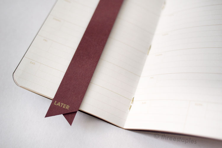
A nice bonus for subscribers: a matching bookmark with gold text. It's a long, thin strip of paper folded in half, labeled “NOW” on one side and “LATER” on the other.

Last but not least, Ambition has its edges gilded. Even the covers. Wow. Every season, I wonder what new thing Field Notes is going to try but gilding never crossed my mind for some reason. When I saw the announcement, I wondered how they’d look, since Field Notes are relatively thin compared to all the gilded books I’ve encountered in the past. And the round corners! Would they be gilded okay, I worried. Turns out, I had nothing to worry about.

A screencap from the official Ambition video: these look like little nuggets of gold!
It sounds like this edition was quite a learning experience for Field Notes, as far as gilding goes, and a labor of love. They had to haul all that paper back and forth, first for printing at eDoc Communications, then embossing at Nu Wave, back to eDoc for binding, and then finally gilding at Liberty Book and Bible. I really think they could’ve gotten away with not embossing the covers but then Field Notes would not be Field Notes, I suppose. No wonder this edition is called Ambition!

Now, I must mention that I am not a big fan of the weekly datebook. One of my pet peeves with planners in general is Saturdays and Sundays getting only half the space. Weekends should be twice as big, if anything! The injustice! But I know why, design-wise, this happens often in planners. I love everything else about Ambition that I’m going to make this work. The “Double Knee Duck Canvas” light brown ink on the innards is light enough that I should able ignore all the special lines and text and just use the planner like a regular ruled memo book. Plus, I understand thematically why the planner is included in the trio. It makes enough sense as the year-end edition and a great idea as a gift, that I can’t bring myself to disregard the whole edition because of the planner.
(Sidenote: By now, you should know that the fun ink names in the Specifications are not specific to actual inks but are named by Field Notes. Ambition is printed with Saphira ink, instead of the usual Toyo ink but the light brown ink is still called “Double Knee Duck Canvas”.)
My feelings towards Field Notes Colors had been aggressively lukewarm in 2014 (see my ranking to see how the earlier 2014 editions fare) but Ambition really turned things around and ended the year on a high note for me. I store some of my Field Notes upright in the outside pocket of my bag, and the little flash of gold at the top of Ambition really lifts my mood. And it reminds me that I need to get sh*t done.

Some fun (for me) details:
- Ambition is the 25th in the COLORS series. It is the winter edition of 2014.
- Item Number: FNC-25
- Edition size: 30,000 packs, November 2014
- Cover: French Paper Co. Speckletone 100#C with embossed logotype. The ® mark is not embossed. Text printed with metallic soy-based Saphira ink in “Ambitious Gold”.
- Ledger: green cover in “Olive”, the same cover as in Balsam Fir
- Weekly planner: brown cover in “Chocolate”
- Graph grid memo book: wine cover in “Wine”
- Paper inside: Cougar Natural 50#T Smooth printed with soy-based Saphira ink in “Double Knee Duck Canvas” light brown.
- Gilding: By Liberty Book and Bible, Indianapolis, IN, with Ochsner edge gilder and round corner guilder.
- Embossing: By Nu Wave Diecutting & Finishing, Chicago, IL.
- Belly band: Matching cream color with light brown text
- Extras: a bookmark for subscribers
- Staples color: gold
- Film: Ambition on Vimeo, and a funny story to go with it
My Favorite “Practical Applications”:
- #05. Bridges Burned (I really want this print)
- #06: Swiss Bank Account Numbers
- #20. Possible Domain Names (Ha! I just recently let many expire.)
- #23. Blue Sky Solutioneering
What are your thoughts on Ambition? Which book is your favorite?

Quick color comparison of brown, from left: Drink Local Ales “Stout”, Traveling Salesman, Ambition, Drink Local Lagers “Bock”.

Quick color comparison of red, left to right, top then bottom: Arts & Sciences, Ambition, Drink Local Lagers “Bock”, County Fair, Fire Spotter (or is it Red Blooded?), National Crop “Sorghum”, Drink Local Ales “Amber Ale”.

Quick color comparison, from left: Balsam Fir, Ambition, Day Game, Original kraft.