Yellow is not an uncommon color for Field Notes memo books. Almost every year, there’s been a yellow Field Notes from the COLORS series, starting with Packet of Sunshine in 2010. Can you name all the yellow Field Notes so far?
COLORS Editions
Here they are:
- Packet of Sunshine (Spring 2010)
- County Fair (Summer 2010)
- National Crop “Corn” (Spring 2012)
- Drink Local “Pale Lager“, “Pilsner”, and “India Pale Ale” (Fall 2013)
- Unexposed (Fall 2014)
- Two Rivers (Spring 2015)
This is a longer list than white, isn’t it?
I realize “India Pale Ale” from Drink Local (far left, pictured above) is borderline yellow, being very close to light brown, tan, or even orange but I thought it was close enough to “yellow” that it’d be fun to include. Two Rivers is also included because of its base color, even though it is the only one that’s not completely solid yellow. Again, I thought it shared enough similaries with other yellow books that it deserves to be included. I think that some of these can easily belong in other color groups, so don’t be surprised to see them again in future comparison posts!
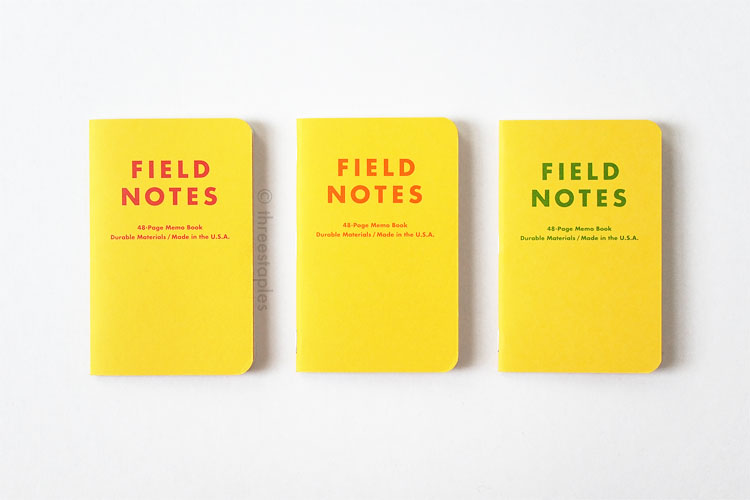
Texture-wise, I can divide the yellow books into two groups: matte and soft-touch coated. Drink Local and Unexposed covers belong in the latter group, and the rest make up the matte group. County Fair is the only one with the linen texture, with Neenah Sundance Linen as its cover. The other three matte covers, Packet of Sunshine, National Crop’s “Corn,” and Two Rivers, all use French Paper Pop-Tone in “Lemon Drop” in 100#C. I find these Pop-Tone covers pretty special because they’re not simply white stock printed with yellow ink, like in other yellow covers. If you look at at them from the side, you can see that the paper is yellow all the way through.
The three books on the far right are all French Paper Pop-Tone in “Lemon Drop.”
Color-wise, I would pick County Fair’s yellow as having the most rich, matte, yellow color, closely followed by the three that use French Pop-Tone. Drink Local’s “Pilsner” is on the dull side for me, and “Pale Lager” looks the lightest. I think of “banana cream” when I look at it. :) The Unexposed’s yellow? That’s like a slap-in-your-face, bright, fluorescent yellow, and I like it the least among the COLORS yellows.
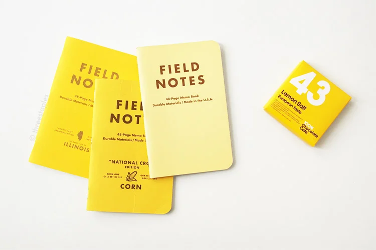
I swear, I happened to be eating that chocolate while taking pictures.
Yellow covers with extra text and graphics on the back. County Fair is the only one printed in gold but it doesn’t look particularly metallic.
Other note-worthy differences:
- Drink Local, National Crop, and County Fair all have “extra” graphics and text, on top of the usual logotype and texts.
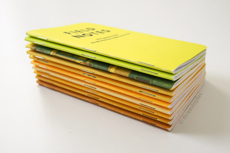
- All have silver-colored staples, except for Drink Local (gold) and Two Rivers (copper).
- Soft-touch coated covers have darker inside covers: dark purple in Unexposed’s yellow and dark brown in Drink Locals.
- Unexposed is the only edition with reticle grid. The rest are regular graph grid.
- The body paper in all yellow editions have the same weight but Packet of Sunshine is the only one with Boise Offset Smooth 50#T in “White.” The rest use Finch Paper Opaque Smooth 50#T in “Bright White.” (Older editions tend to use the Boise paper).
- The most “yellow” graph grids are found in Packet of Sunshine and Drink Local; the rest are either gray or light brown.
Neon Ice Pop (top) and Summer Camp (bottom).
Non-COLORS Editions
The only other yellow Field Notes in my possession are:
- Neon Ice Pop (First printing, January 2010)
- Summer Camp (First printing, May 2011)
They are both from neon, summer-themed editions! I would categorize these as pretty straightforward: outside and inside covers are the same color with no extra graphics or texts, silver staples, and white 50#T innards with graph grid. They both fit in the matte group but their covers are noticeably thinner (French Smart White 80#C printed with yellow inks). And their neon color gives them a much cooler feel, almost light green compared to the rest of the yellow covers. Certainly very different from the “flourescent” yellow from Unexposed, which is warmer and just screams yellow. What I find special about these neon editions is that the body paper is gridded in light blue called “Summer Sky Blue.” Summer Camp is actually one of my favorites, and if it were a COLORS edition, it would place very high in my Field Notes ranking. I might even do a separate post on the subtle differences between Neon Ice Pop and Summer Camp in the future.
From left: Summer Camp, Neon Ice Pop, and Unexposed.
The only other edition that’s yellow that I am aware of is Capsule Show’s 5th anniversary edition from 2012. I WANT IT. It’s debossed, for goodness sake. *sigh* Well, if you know of any other yellow editions, do chime in!
Inside covers, not yellow in Drink Local and Unexposed.
Innards, from left: Two Rivers, Unexposed, Drink Local, National Crop “Corn”, County Fair, Packet of Sunshine, Neon Ice Pop, Summer Camp.
Adding Original kraft on the far right!
Do you like yellow Field Notes? If so, which is your favorite? For me, it’d be a toss-up between Packet of Sunshine and County Fair. Packet of Sunshine for its sunny-ness (heh) and County Fair for its linen texture. Hm... I wonder if there’ll be any more yellow this year.


