American Tradesman is not one of my top favorites among Field Notes COLORS memo books (see how it ranks in my ranking page). In fact, I used them all up and don’t have any blank ones left for posterity. I used them up for daily and travel journaling, and for that purpose, they performed perfectly fine.
What I don’t like about this edition is the texture of the cover stock. I just think it’s “meh.” That’s the most negative thing I can say it. I like the silver text against the blue, and how the inside cover is a different color from the outside with the contrasting red text. The color scheme is definitely appropriate for a summer release, too. It’s just that there are other editions that I have stronger attraction to, that this one just pales in comparison.
Firsts
This is not the first time a Neenah duplex cover stock is used (that’d be Raven’s Wing) but it is the first time Neenah Classic Columns is used. While Raven’s Wing’s cover is Neenah Classic Linen, American Tradesman has a vertical linear finish. And as I mentioned earlier, it’s my biggest complaint about this edition. While I agree the ridged look goes well with the workshop appeal, it reminds me too much of generic brown boxes. (But I have absolutely no problem with the regular “Packing Brown Wrap” covers. Go figure!)
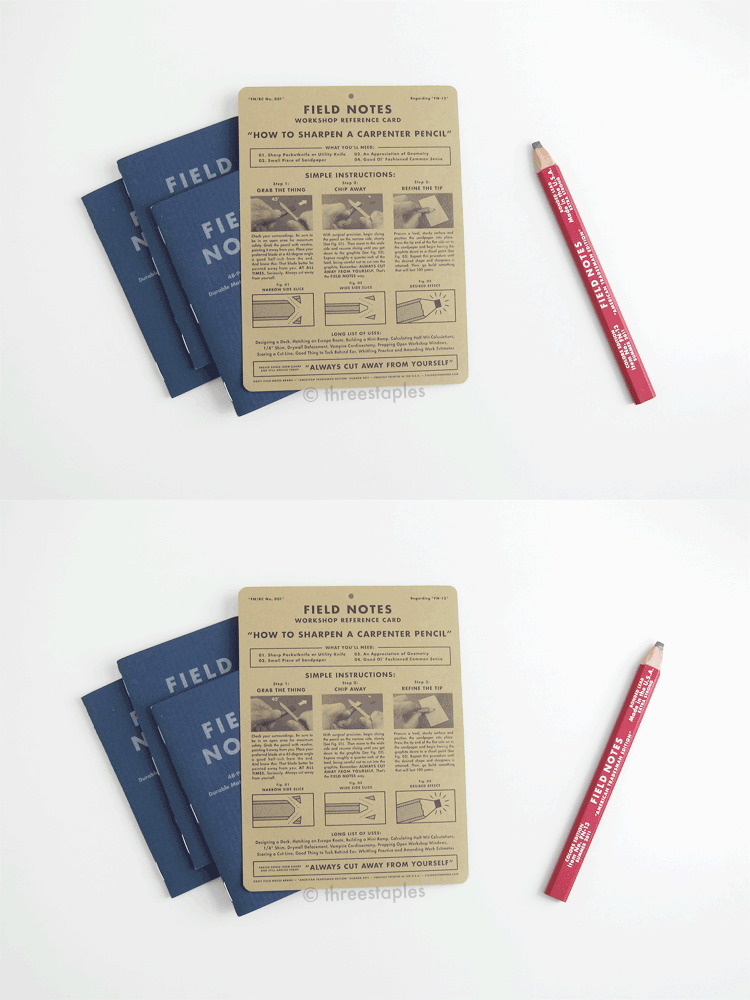
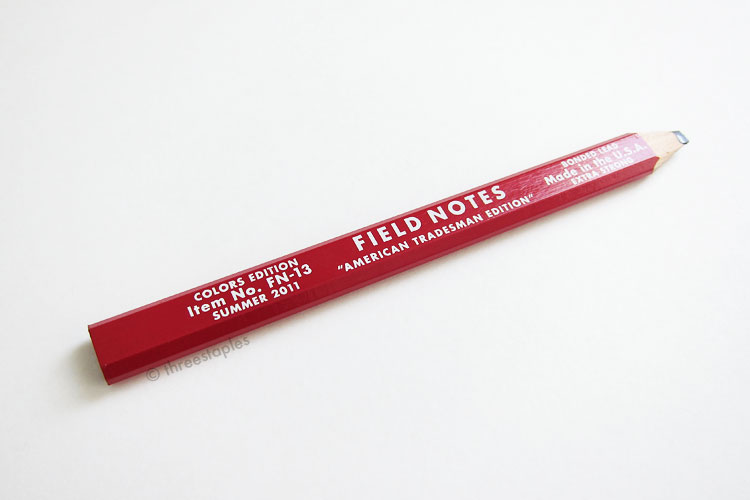
Many earlier editions came with something extra (Packet of Sunshine, County Fair, Balsam Fir) but what’s unique about this edition is that it came with a carpenter pencil, labeled FN-13. It even came with a reference card (labeled FN/RC No. 001 and packaged in a clear zip-lock bag) that instructs you on how to sharpen the pencil. “Always cut away from yourself!” This reminds me of the time I badly cut my finger trying to sharpen a pencil with a knife. I must have been in 2nd grade or something, and to this day, I don’t understand why I was trying to use a knife. It’s not like I didn’t have a pencil sharpener then.
ANYWAY.
I don’t really have a use for the carpenter pencil but I sharpened it as you can see. I guess I just like sharpening things?!?
Word on the street is that Field Notes ran out of the red carpenter pencils, so they had to substitute them with white carpenter pencils later on. White looks good too! At some point, black ones were also made (see An Obsessive’s Guide to Field Notes: Part Three video) but I do not see them in the online shop at this time. Remember, these later-released, black/white and red/white pencils are not labeled “American Tradesman Edition”; they are labeled as “All-purpose carpenter pencil.” Check out this blog post by The Write Obsessions for all three colors together! And how about these orange and yellow ones by Aaron Draplin himself, way back in 2008? Sweet.
Some fun (for me) details:
- American Tradesman (Summer 2011) is the 11th edition in the COLORS series.
- Item number: FN-01
- Edition size: 15,000 books were printed in June 2011.
- Outside cover: Neenah Classic Columns 120#C Duplex in “Indigo/Avalanche White” with “Jefferson Nickel” silver text
- Inside cover: text in “Concord” red
- Graph grid inside: “Spacious Skies” light gray soy-based Toyo ink
- Paper inside: Finch Paper Opaque Smoth 50#T “Bright White”
- Belly band: white with black text
- Extras for subscribers and retail: one carpenter pencil “FN-13” in red/white or white/red with text “American Tradesman Edition” and either “Colors Edition” or “Measure Twice” on the left. A reference card FN/RC No. 001 was also included.
- Staples color: silver
- Film: none
Interestingly, the “Practical Applications” on the back cover are the same as the ones you find in the original kraft brown memo books. I think Field Notes have raised my expectations too high over the years that I find this a bit disappointing. Woe is me.


