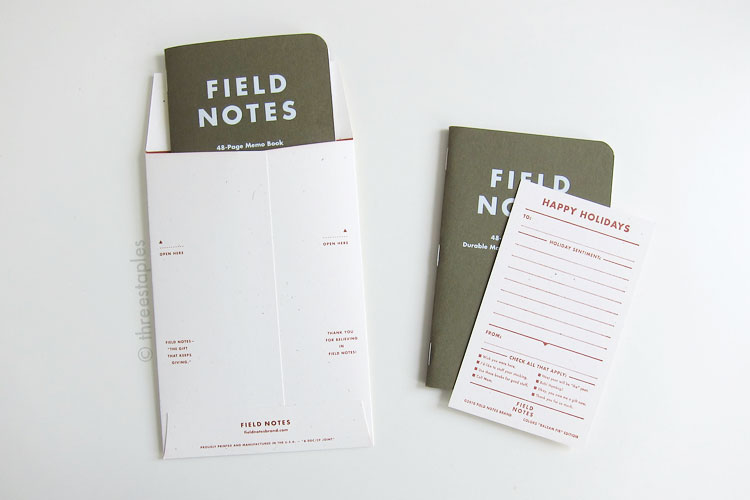
Ah, Balsam Fir. One of my top favorite editions. The edition Jim Coudal (of Field Notes Brand and Coudal Partners) described as the “biggest screw-up” because they didn’t get them ready in time for the Christmas shopping season. Whatever, these are definitely not a screw-up in my book. I loved using these. Something about the foil-stamping, how the white text almost looks glossy and cool-toned against the warm, dark green of the matte cover stock… I really think the finished look of Balsam Fir perfectly matches the intended theme for this release, and I wholeheartedly agree when they say:
“Think of a heavy, fresh snow on the boughs of a proud Midwestern fir tree.”
Overall, I think it looks quite sophisticated but it still captures the spirit of Field Notes. It is probably not a coincidence that the Day Game edition, also foil-stamped, is another of my top favorites.
The 3-pack of Balsam Fir came with an envelope (with red lining!) and a letterpress card, so that you can insert the pack into the envelope for holiday gift-giving. I still have these envelopes and cards. Because I’m selfish. No giving these babies away!
Firsts
What’s interesting about this edition, besides the accompanying envelope and card, is that it is the first edition to feature foil stamping, where the foil in this case is non-metallic, matte white (explained better here). You must watch the Making of Balsam Fir video to see how these are printed! It’s fascinating. And calming. I love me some Beethoven.
This edition was also the first time two different belly bands were used. For the COLORS subscribers, the belly band was off-white and speckled (French Paper’s Speckletone) with red text, while the retail version came with regular white belly band with black text. I don’t have the belly band for this edition anymore, and I don’t remember what it looked like. The inside cover reveals that I have the retail version? It’s labeled as “Kraft Green” (as opposed to “Balsam Fir”).
Which is strange because I swear I got these as part of the subscription… I didn’t get that sprig of spruce either… Darn my fuzzy memory. Oh well.
Some fun (for me) details:
- Balsam Fir (Winter 2010) is the 9th edition in the COLORS series.
- Item number: FN-01
- Retail version is labeled as “Kraft Green” on the back inside cover.
- Edition size: 10,500 books/3,500 packs printed in December 2010.
- Outside cover: French Paper Co. Speckletone 100#C “Olive” with foil-stamped white text
- Inside cover: text in “Wet Bark Black” soy-based Toyo ink
- Graph grid inside: “Coniferous Green” soy-based Toyo ink
- Paper inside: Finch Paper Opaque Smooth 50#T “Bright White”
- Belly band for the subscription version: French Paper Co. Speckletone in “True White” with red text
- Belly band for the retail version: White paper with black text
- Extras: holiday card/envelope in the same French Paper Co. Speckletone in “True White" and sprig of spruce.
- Staples color: silver
- Film: Making of Balsam Fir
I wanted to choose a favorite among the “Practical Applications” from this edition but I see that they are the same as the “regular” ones from the original kraft Field Notes. Anyone want to confirm this with their Balsam Firs? Does the subscription version have different “Practical Applications”?
Also, I noticed that this edition uses Finch Paper, instead of Boise Offset of the previous edition, Raven’s Wing. Is this when they switched the paper? I see that most of the editions since Balsam Fir use Finch Paperexcept for Expedition and Traveling Salesman.
If you haven’t noticed, I obsess over details. Can’t be good for my sanity.


