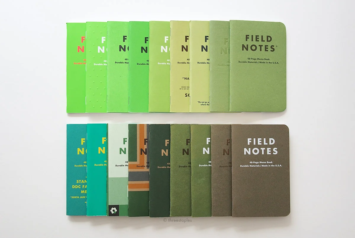
At the risk of this post becoming immediately outdated if the upcoming 2017 Fall Edition turns out to be a green edition, I present you some pictures of green Field Notes! There have been many green Quarterly Editions so far, and in this post I'm focusing on a broader range of the color, including some non-solid covers that are predominantly green.
Pictured above, in the top row (from left):
- Unexposed (Fall 2014)
- Starbucks Capitol Hill
- Neon Ice Pop
- Summer Camp
- Our503
- National Crop “Soybeans” (Spring 2012)
- Flagged by Ellen
- Grass Stain Green (Summer 2009)
- Shenandoah “Sweet Birch” (Fall 2014)
Bottom row (from left):
- DDC Standard Issue “Sorta Jade”
- Starbucks Coffee Origins “Asia/Pacific”
- Workshop Companion “Gardening” (Summer 2015)
- Portland
- L.L. Bean (2016)
- Shenandoah “Chestnut Oak” (Fall 2014)
- Day Game “Outfield Green” (Summer 2012)
- Ambition (ledger) (Winter 2014)
- Balsam Fir (Winter 2010)
About half of these are Quarterly Editions; the non-COLORS editions are italicized in the list above. Hmm, looks like green is quite a common color choice, huh? And it’s good to see them spread out among all four seasons.
The above covers are all matte in texture, except Starbucks Capitol Hill, Starbucks Coffee Origins, and Unexposed. These feature Sappi McCoy 100#C White as the cover stock, and have that slightly glossy, soft-touch feel. Capitol Hill is unique in that it is embossed all over with a polka dot pattern. Ambition is also embossed but only the logotype is. Grass Stain Green is letter-pressed on the other hand, and Balsam Fir and Day Game are foil-stamped in white.
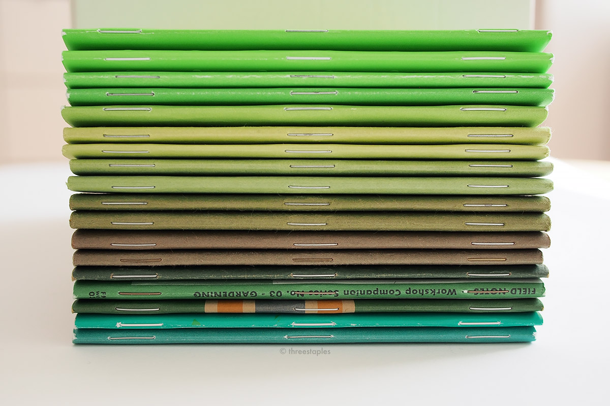
All are bound by silver-colored staples, except Starbucks Capitol Hill and Starbucks Coffee Origins (white staples), Ambition (gold-colored), and Workshop Companion (brass).
As you can see above, Ambition is the only one with gilded pages. I won’t get too deep into comparing what’s inside these memo books, but Ambition is also the only one here with the ledger format. Also, not all are graph-grid. Unexposed and Capitol Hill are reticle-graph grid, and Our503 and DDC have blank pages. Day Game, Workshop Companion, and Starbucks Coffee Origins are dot grid.
One of the fun things about comparing Field Notes colors, at least for me, is discovering duplicates, where the same cover stock is used. I think it’s cool how they manage to interpret the same paper and color in different ways, so it doesn’t bother me when a new edition uses the same cover stock as an older one. Here are some notable examples (I won’t get into the white cover stocks that are printed green):
- Balsam Fir and Ambition both use French Paper Speckletone in “Olive” as their cover.
- National Crop and Flagged by Ellen use French Paper Pop-Tone in “Sour Apple”.
- Day Game “Outfield Green” and Shenandoah “Chestnut Oak” both use French Paper Pop-Tone in “Jellybean Green” (outside on the Shenandoah’s custom-duplex cover)
- Grass Stain Green and Shenandoah “Sweet Birch” feature French Paper Pop-Tone in “Gumdrop Green” (again, just on the outside of Shenandoah’s custom-duplex cover).
Ambition and Balsam Fir, in the upper right corner (I’m reusing old photos, can’t you tell?)
Shenandoah “Sweet Birch” & Grass Stain Green on the left, Day Game & Shenandoah “Chestnut Oak” in the middle.
Other custom green Field Notes that I know of but don’t have:
- Webstock 2013
- Flag Nor Fail
- The Field Museum (oh how I want this!)
- Carhartt
Both Flag Nor Fail and The Field Museum use French Paper Pop-Tone 100#C “Gumdrop Green” – same as Grass Stain Green and Shenandoah “Sweet Birch”. Popular green paper of choice, apparently! It’s not hard to see why, though; it’s a lovely, textured, medium green. Webstock 2013 also looks like the same “Gumdrop Green” but I can’t be sure. If you can verify this or know of other “green” Field Notes editions, do leave a comment!
What are your thoughts on green Field Notes so far? Want to see more, or have we had enough? Personally, I’d love to see French Paper Pop-Tone “Limeade” someday or shades of dark green some more, preferably in linen-texture. One can only hope.


